Saturday, 29 October 2016

FODMAPs 02 – Exploratory data analysis… Also, I think I have a beef and wedding intolerance

Previous post in this series: FODMAPs 01 – Data collection.

I have been collecting data for five weeks in an attempt to identify what foods cause my symptoms of food intolerances. Using the Memento Database app, I log the intake of each food/ingredient, which is datetime stamped. Here’s a snapshot of the exported CSV. The Fibre column indicates if I took some psyllium husk as recommended by my dietitian. Enzymes indicates when I took a magic out-of-body enzyme pill, which was rare.


My intolerance symptoms post-meal was recorded with datetime stamps. I used four descriptions: "Bloated" was when I was feeling, well, bloated. "Tightening" was when my guts felt uncomfortably tight during digestion. "Fatigue" was when I suddenly felt tired. "Abdominal pain" indicated sharp stabby pains in my gut. Since I’m not concerned about these distinctions, I coded each symptom with “1”. I wish to identify the foods that cause ANY symptoms of intolerance. A good day is when I have no symptoms.

The data was wrangled. Datetimes were coerced to dates. Foods and Symptoms datasets were joined by date. Here’s a look at the merged data in RStudio. It’s terribly simple – Date, Food, Symptoms (flagged with “1” when present on a given date).


I’m no dietician/nutritionist. I assume that when one tries to identify problem foods in one’s diet they look at when the symptoms occur, then look back to see what foods were consumed. With that general approach, I chose some strict parameters to identify the bad foods that led to intolerance symptoms.

Any day of a symptom is considered a bad day. Even one symptom. Thus, a good day was a symptom-free day. To my delighted surprise, I had a string of good days. Setting my diet to low-FODMAPS did make me feel generally better. I was less fatigued, I could concentrate more at work, and I had more nights of decent sleep. Sure, I became a social bore when I limited what food I could eat when dining out. Telling friends I could just go out for tea was met with disappointment. It was easier to stay at home and eat cold cuts by my lonesome. This was all in the name of science, and data, and in the next blog post, some data science (logistic regression).

Consider the good days. The code would look at the previous day and note the foods that were consumed. These foods were all considered “good”. Let’s think about this moving forward in time – I would eat all this good mostly gluten-free food. The following day I would be symptom-free. Therefore, any food the day before a symptom-free day is in my good books.

Consider the bad days. Similar premise – any food consumed the day before a bad day are bad foods. But not all of them. I have a mix of good and bad foods, followed by a bad day. I can’t cast the good foods caught in this net as bad by association. Therefore, any food on my good food list was used to subtract-out from the bad food list. A “really bad” food list became the difference. Drum roll… Here are the really bad foods.


OK, a couple of things stood out. I think I’m allergic to weddings. “wedding beef”, “wedding cake”, “wedding canapes”, “wedding salad”. Guys, I went to a weeding during the diet, OK? I couldn’t not eat the food, it was really really good. Other foods consumed at the wedding included the potato, prawns, pumpkin, oysters. Resolution one: Avoid weddings [1].

There was another grouping I discerned from the really bad foods list. “beef mince”, “beef patties”, “olivo wagyu steak”, “wedding beef”. OMG, I think I have a beef intolerance. No! Stupid, stupid ethnic digestive tract, why?

I Googled – beef intolerance is indeed a thing. As is intolerance towards asparagus, basil and cauliflower. I’m not jumping to conclusions. I have an appointment with my dietitian in several weeks, and I’ll show her the data. She may very well think this approach was a bit much, but, I truly believe that the little data we collect has meaning. Now, it’s easier to collect data, primarily because most data collection occurs in an automated fashion. From Fitbit to Netflix and Google, there’s a spectrum of our personalised data being gathered. Sometimes this data is accessible, such as from Fitbit. Taking those next steps from reported data to insightful and actionable data may take some coding [2].


References and notes
1. I was concerned that my bad days were simply the wedding day. Not the case. I had 16 days when I consumed from the really bad foods list.
2. The code fodmaps_wrangling_exploration.R is on GitHub repo: https://github.com/muhsinkarim/fodmaps

Wednesday, 28 September 2016

Facebook experiments – Using a technical glitch to nudge user’s behaviour, maybe

For a couple of weeks’ I would log onto Facebook and two of my friend’s chat windows would appear. I would close them both down, mindlessly browse the News Feed then switch to something more interesting, with turns out to be anything. The next day I would repeat the process – the same two chat windows popped-up, unprompted by any messages from my friends. I’m not an active Facebook user, yet this was irritating. I half-heartedly Googled for a solution but gave up because only half my heart was invested.


Earlier this week I logged on and the issue appeared to have resolved itself. Yesterday I received a message from one of these Facebook friends via my Messenger app. This friend asked if I was free for coffee on the weekend. I am and wrote back. I’ve only met this person twice in real-life occasions spread over years, but the last time we spoke (about a month ago) we got on well and we swapped a few Facebook messages after. I’m glad she arranged a meet-up in the real-world.

Then my paranoia set in. Was this apparent chat window glitch a cleverly disguised Facebook experiment? We know that Facebook runs experiments. What if Facebook sampled its users, popped-up some chat windows, then tracked how many people engaged in further chats? Did the display of the glitch windows cause a lift in chat-engagement? With some text analysis, did it result in plans for a real-world meet-up?

I barely see these two friends – one is living in regional NSW and the glitchy chat window is not compelling enough for me to visit her where there is no city. I’ll check with my real-life coffee friend if she received my chat window as a pop-up and whether it nudged her to reach out. If so, cool. The potential for Facebook to run different experiments is expansive and creative – using glitches as a guise, what else can/do they do? As a former research scientist, I respect it and am envious that they can tweak the Facebook world, sit back and watch users shift their behaviour.

Saturday, 24 September 2016

FODMAPs 01 – Data collection

There’s something in my diet that ain’t sitting right. It makes me feel bloated, fatigued and just damn uncomfortable. It’s been like this for years, though it’s been tolerable. Recently I went to a dietitian/nutritionist to learn more about what I should and should not shove down my mouth.

After describing my general diet, I received advice that will sound obvious to most. I need more fruits, vegetables, fibre and water.
“How many fruits and veges am I supposed to eat?”, I asked.
“Two serves of fruit, three serves of vegetables a day.”
“Oh, so the recommendation hasn’t changed since kindergarten?”. I was really hoping that it had been scaled back to two fruits per day. Or one magic fruit pill.

I took the advice as best as I could manage (who has time to eat five serves of vegetables a day? Takes so long to chew). There were marginal improvements. I felt less bloated and fatigued, so my decisions were leading me in the right direction. Similarly, I had stopped drinking coffee back in March and noted improvements. Each dietary change added an improvement.

However, I still feel uncomfortable. Years ago I attempted to rectify my dietary issues with data. I recorded what foods I was eating and what symptoms I felt day to day with the intention to analyse my way to a remedy. I planned to “net” what foods caused upset. I never got around to the analysis.

I’m getting around to it now. I have the right tools.

The nutritionist said I should try a low FODMAP diet. FODMAPs are a group of carbohydrate that are poorly digested. After a FODMAP diet of at least 6 weeks, I’ll gradually reintroduce different FODMAP groups and note my tolerance. I can identify my problem foods then avoid them. But not ice cream. If ice cream is a problem food, I’ll just take lactase beforehand.

I need an app that collects my food intake. I’ve used myfitnesspal in the past. When I Googled for instructions on exporting my data, I couldn’t find a clear guide, or it was a paid option. I can log foods with the Fitbit app, however retrieving the data is also not easy. The Fitbit R scraper I use does not retrieve food data. I would have to access my data via an API.

Instead I’ll use the Memento Database app. Memento Database allows users to customise fields for data capture then easily export the data as CSV. My “Food” library captures the foods or ingredients I consume with the current datetime captured upon entry. I will use short general labels for foods and ingredients as possible since I’d like to group the foods for analysis.

My “Symptoms” library captures a symptom with the datetime. I used to enter detailed symptom descriptions. I want to keep it brief. I'll include feelings of "Fatigue" or feeling "Bloated". The symptoms will be placed in a single-choice list. I expect that these symptoms will decrease as I persist with the lower FODMAP diet. The symptoms will increase when I reintroduce the problem FODMAP groups. Ice cream will totally be fine. Totally.

I will combine this food and symptom data with Fitbit data, namely calories burned, weight and sleep. I’m curious to see if my weight changes with the diet (assuming little change in the calories burned day-to-day) or if my sleep improves. 

In say, 6 weeks’ time, I’ll have data to wrangle then analyse.

Tuesday, 13 September 2016

Building plots with ggraptR’s code gen

Building plots for R newbies is a challenge, even for R not-so-newbies like myself. Why write code when it can be generated for you?

I have put my hand up to volunteer towards an R visualisation package called ggraptR. ggraptR allows interactive data visualisation via a web browser GUI (demonstrated in a previous post using my Fitbit data). The latest Github version (as of 13th September 2016) contains a plotting code generation feature. Let’s take it for a spin!

I have a rather simple data frame called ""dfGroup" that contains the number of Breaking Bad episodes each writer wrote. I want to create a horizontal bar plot with the “Count” on the x-axis and “Writer” on the y-axis. The writers will be ordered from most episodes written (with Mr Vince Gillian at the top) to least (bottom). It will have an awesome title and awesomely-labelled axis. The bars will be green. Breaking Bad green.


Before code gen, I would Google “R horizontal bar ggplot with ordered bars”, copy paste code then adjust it by adding more code. The ggraptR approach begins with installing and loading the latest build:

devtools::install_github('cargomoose/raptR', force = TRUE)
library("ggraptR")

Launch ggraptR with ggraptR().

A web browser will launch. Under “Choose a dataset” I selected my dfGroup data frame. Plot Type is “Bar”. The selected X axis is “Writer” and the Y is “Count”. “Flip X and Y coordinates” is checked. And voilĂ  – instant horizontal bar plot.


Notice the “Generate Plot Code” button highlighted in red. Clicking on said button – a floating window with code will appear.


I copied and pasted the code in an R script. I tidied the code a bit as shown below. Running the code (with dfGroup in the environment) will produce the plot as displayed with ggraptR. 


With a tiny bit of modifying – adding a title, changing the axis titles and filling in the bars with Breaking Bad green, we have the following:


One last thing – the bars are not ordered. Currently the bars cannot be ordered with ggraptR. I can reorder the bars using the reorder function on the dfGroup data frame. Back in RStudio, I run the following:

dfGroup$Writer <- reorder(dfGroup$Writer, dfGroup$Count)

then execute the modified code above and we have plotting success!


Using ggraptR you can quickly build a plot, use code gen to copy the code then modify it as desired. Happy plotting!

Sunday, 29 May 2016

Fitbit 03 – Getting and wrangling all data

Previous post in this series: Fitbit 02 – Getting and wrangling sleep data.

This post will wrap-up the getting and wrangling of Fitbit data using fitbitscraper. This is the list of data that was gathered [1]:
  • Steps
  • Distance
  • Floors
  • Very active minutes (“MinutesVery”)
  • Calories burned
  • Resting heart rate (“RestingHeart”)
  • Sleep
  • Weight.

For each dataset, the data was gathered then wrangled as separate tidy data frames. Each data contained a unique date per row. Most datasets required minimal wrangling. A previous post outlined the extra effort required to wrangle sleep data due to split sleep sessions and some extra looping to gather all weight data.

Each data frame contains a Date column. The data frames are joined by the unique dates to create one big happy data frame of Fitbitness. Each row is a date containing columns of fitness factors.

Now what? I feel like a falafel. I’m going to eat a falafel [2].

With this tidy dataset I will continue the analytics journey in future posts. For now, I wish to quickly visualise the data. Writing lines of code for plots in R is not-so-quick. Thankfully there’s a point-and-click visualisation package available called ggraptR. Installing and launching the package is achieved as follows. 
devtools::install_github('cargomoose/raptR', force = TRUE) # install
library("ggraptR") # load
ggraptR() # launch

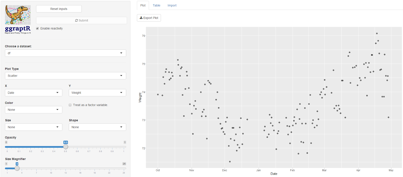
My main hypothesis was that steps/distance may correlate with weight. There was no relationship observed on a scatter plot. This is preliminary, future post will focus on exploratory data analysis. Prior to data analysis I need to ask some driving questions.


I plotted Date vs Weight. My weight fell gradually from October 2015 through to December. I was on a week-long Sydney to Adelaide road trip during the end of December, got a parking ticket in Adelaide and did not have recorded weights whilst on the road. My weight steadily increased since. Not a lot of exercise, quite a lot of banana Tim Tams.


After sequential pointing-and-clicking, I overlayed this time plot with another factor - the “AwakeBetweenDuration”. In the previous post I noted I wake-up in the middle of the night. It may take hours before I fall asleep again. The tidy dataset holds the number of minutes awake between such sessions. The bigger the bubble, the longer I was awake between sleep sessions.


Here’s a driving question: what accounts for the nights when I am awake for long durations? I was awake some nights in October, December (some of my road trip nights – I couldn’t drive for one of those days as I was exhausted), January and then April. February and March appeared almost blissful. Why? Tell me data, why?  

Here is the Fitbit data wrangling code published on GitHub, FitbitWrangling.R: https://github.com/muhsinkarim/fitbit Replace “your_email” and “your_password” with your email and your password used to log into your Fitbit account and dashboard.


References and notes
1. The fitbitscraper function get_activity_data() will return rows of activities per day including walking and running. I only have activity data from 15th February 2016. Since I’m analysing data since October 2015 (where I have weight data from my Fitbit scales) I chose not in include activity data in the tidy dataset.
2. I ate two.

Thursday, 26 May 2016

Where's my repo? Using the GitHub app

Sharing code with the internets is made possible with GitHub. In a previous post I outlined how to add, commit and push code on GitHub via Git Bash, a scary looking terminal that sane people avoid. I’ve since played with the GitHub app which makes sharing even easier. Here I will create a repo and share my Fitbit R data wrangling code.

I’ve assumed one has a GitHub account and the GitHub app installed. I first need to create a repo. On the GitHub site I clicked on the “+” symbol and selected “New repository”. There’s also a helpful green “New repository” button which would have saved me one click. 


I entered “fitbit” as my repository name then selected “Create repository” at the bottom.


On the next screen (above) I selected “Set up in Desktop”. An “External Protocol Request” popup appeared and I selected “Launch Application”. Then magic happened. Magic. I was prompted to select where I wished to place my repo on my local machine (below). My repos exist under Documents > GitHub. Hitting OK, the repo cloned. My fitbit repo appeared on the left hand side of the GitHub app. 


Browsing to the fitbit repo directory on my local, I pasted the code I wish to share.


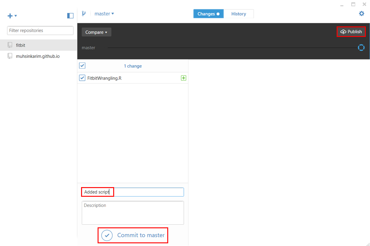
Returning to the GitHub app, it’s detected the addition of my script. I enter something in the “Summary” text field then select “Commit to master” below the “Publish” top right.


Then returning to GitHub, I hit refresh on my fitbit repo, and boom! My script appears on the internets. As I make changes to the script on my local, the GitHub app will allow me to commit changes and publish online.

Sunday, 15 May 2016

Fitbit 02 – Getting and wrangling sleep data

Previous post in this series: Fitbit 01 – Getting and wrangling weight, steps and calories burned data.

Let’s continue to get and wrangle Fitbit data. This post will tackle sleep data and address my unattractive trait of not easily letting things go.

I applied the following R package fitbitScraper function wrapped in a data frame:
dfSleep <- as.data.frame(get_sleep_data(cookie, start_date = startDate, end_date = endDate))

There’s a lot of data. Below is the list of columns I want to keep:
  • df.startDateTime – The start datetime of sleep.
  • df.endDateTime – The end datetime of sleep.
  • df.sleepDuration – The minutes between the start and end time. df.sleepDuration = df.awakeDuration + df.restlessDuration + df.minAsleep".
  • df.awakeDuration – The minutes of wakefulness.
  • df.restlessDuration – The minutes of restlessness.
  • df.minAsleep – The minutes of actual sleep. I want to maximise this data field. More sleep less grumpiness.

If you’re a normalish human being, you would look at the sleep data and examine it for any anomalies. Your keen eye will note that some sleep durations are split across two or more sessions. That is, you went to bed, woke up in the middle of the night, then fell asleep again. Depending on how long you were awake for, Fitbit will record separate sessions.

I am working towards a tidy dataset with each row representing a unique date with the day’s Fitbit data. Separate sleep sessions cause duplicate dates. Being a normalish human being, you write code that will group the split sleep sessions back together. Unique dates per sleep lends to tidy data.

If you’re not a normal human being, you examine the intricate nature of these split sleep sessions and spend way too much time writing code that groups the data back together.

I am not a normal human being.

Split sessions occur for two reasons. The first occurs when I wake up in the early hours of the morning. An example is below.


On the night of the 22nd March I fell asleep at 23:37. I woke up at 3:49 on the 23rd. After hating my life and eating morning chocolate, I finally fell asleep again at 4:51. Technically the second session date should be displayed as the 23rd of March, not the 22nd. These display dates are akin to the “date I tried to fall asleep”. The datetimes record the true date and times.

When I combine these separate sessions, the new sleep start time will be 23:37 and the new sleep end time will be 07:46. The SleepDuration, SleepAwakeDuration, SleepRestlessDuration, SleepMinAsleep, SleepAwakeCount and SleepRestlessCount values will be summed together. I would also like to note the number of minutes I spent awake between sessions and the number of separate sessions (two in this example).

The second split sleep session type appears to be a glitch with sessions being separated by a difference of one minute. An example is below. 


On the 23rd of February I have sleep sessions ending at 03:47 then resuming at 03:38. There are multiple instances where this occurs in my datasets. As before, the sleep variables from both sessions will be summed. I don’t need to note the minutes between the sessions as the one minute difference is meaningless. Further, the number of sleep sessions should be recorded as one, not two.

There’s a final consideration with split sleep sessions. Consider the below.


According this this display, on the 8th April I slept from 22:23 to 5:27, then on the 21:06 to the 23:57 on the same day. No I didn’t! The sleep session datetimes are overlapping. The session displayed on the 8th April from 21:06 to 23:57 should read the 9th April, not the 8th. This session needs to be combined with the sessions displayed on the 9th April from the 23:58 to 6:03. I may not be a normal human being, but I have my limits. For this last case, I did not write a patch of code that could group the data appropriately. Since there were few instances when such overlapping sessions occurred, I let it go – such sessions were removed from the dataset resulting in missing sleep data for that particular date.

Here is a quick plot of the average number of minutes asleep per weekday. Nothing out of the ordinary. I sleep an average 7.6 hours on Sunday nights and an average 6.4 hours on Wednesday nights. I can’t think of a reason why I get fewer hours on a Wednesday night. 


I spend most of my time wrangling data. I come across problems in datasets as described above often, and write code to return the numbers back to reality as much as possible. When the costs (time and effort) outweigh the benefits (more clean data) I have to let some data go and remove it.


I have outlined the code at the end of this post for the avid reader.
#### Sleep        
        
    ### Get data
    
        dfSleep <- as.data.frame(get_sleep_data(cookie, start_date = startDate, end_date = endDate))


    ### Keep key columns
    
        dfSleep <- dfSleep[ , c("df.date", "df.startDateTime", "df.endDateTime", "df.sleepDuration", "df.awakeDuration", 
                                "df.restlessDuration", "df.minAsleep")]

        ## Rename colnames
        # Date is sleep date attempt
        colnames(dfSleep) <- c("Date","SleepStartDatetime", "SleepEndDatetime", "SleepDuration", 
                               "SleepAwakeDuration", "SleepRestlessDuration", "SleepMinAsleep")


    ### Combine the split sleep sessions
    
        ## Index the Dates that are duplicated along with their original
        duplicatedDates <- unique(dfSleep$Date[which(duplicated(dfSleep$Date))])
        dfSleep$Combine <- ""
        dfSleep$Combine[which(dfSleep$Date %in% duplicatedDates)] <- 
            dfSleep$Date[which(dfSleep$Date %in% duplicatedDates)]
        
        ## Subset the combine indexed rows
        dfSubset <- dfSleep[which(dfSleep$Combine != ""), ]

        ## Aggregate rows marked to combine
        dfSubset <- 
            dfSubset %>%
            group_by(Combine) %>%
            summarise(Date = unique(Date),
                      SleepStartDatetime = min(SleepStartDatetime), # Earliest datetime
                      SleepEndDatetime = max(SleepEndDatetime), # Latest datetime
                      SleepDuration = sum(SleepDuration),
                      SleepAwakeDuration = sum(SleepAwakeDuration),
                      SleepRestlessDuration = sum(SleepRestlessDuration),
                      SleepMinAsleep = sum(SleepMinAsleep),
                      SleepSessions = n() # Number of split sleep sessions
            )


    ### Get the minutes awake between split sessions    
    
        ## Calculate sleep duration using start and end time using floor (round down)
        dfSubset$AwakeBetweenDuration <- floor((as.POSIXct(dfSubset$SleepEndDatetime) - as.POSIXct(dfSubset$SleepStartDatetime)) * 60)
        dfSubset$AwakeBetweenDuration <- dfSubset$AwakeBetweenDuration - dfSubset$SleepDuration
        
        ## Set any duration less than five minutes to zero
        dfSubset$AwakeBetweenDuration[which(dfSubset$AwakeBetweenDuration < 5)] <- 0


    ### Remove rows of combined sleep sessions
    
        ## Remove any row with AwakenBetweenDuration greater than five hours
        dfSubset <- dfSubset[-which(dfSubset$AwakeBetweenDuration > 60*5), ]


    ### Replace split sessions in dfSleep with dfSubset
    
        ## Prepare dfSubset for merging
        
        ## Remove duplicate dates from dfSleep
        dfSleep <- dfSleep[-which(nchar(dfSleep$Combine) > 0), ]
        
        ## Add new columns
        dfSleep$SleepSessions <- 1
        dfSleep$AwakeBetweenDuration <- 0
        
        ## Remove Combine column
        dfSubset <- dfSubset[ , -which(colnames(dfSubset) == "Combine")]
        dfSleep <- dfSleep[ , -which(colnames(dfSleep) == "Combine")]
        
        ## Bind dfSubset
        dfSleep <- rbind.data.frame(dfSleep, dfSubset)

        
    ### Coerce as date
        
        dfSleep$Date <- as.Date(dfSleep$Date)