Showing posts with label visualisation. Show all posts

Tuesday, 13 September 2016

Building plots with ggraptR’s code gen

Building plots for R newbies is a challenge, even for R not-so-newbies like myself. Why write code when it can be generated for you?

I have put my hand up to volunteer towards an R visualisation package called ggraptR. ggraptR allows interactive data visualisation via a web browser GUI (demonstrated in a previous post using my Fitbit data). The latest Github version (as of 13th September 2016) contains a plotting code generation feature. Let’s take it for a spin!

I have a rather simple data frame called ""dfGroup" that contains the number of Breaking Bad episodes each writer wrote. I want to create a horizontal bar plot with the “Count” on the x-axis and “Writer” on the y-axis. The writers will be ordered from most episodes written (with Mr Vince Gillian at the top) to least (bottom). It will have an awesome title and awesomely-labelled axis. The bars will be green. Breaking Bad green.


Before code gen, I would Google “R horizontal bar ggplot with ordered bars”, copy paste code then adjust it by adding more code. The ggraptR approach begins with installing and loading the latest build:

devtools::install_github('cargomoose/raptR', force = TRUE)
library("ggraptR")

Launch ggraptR with ggraptR().

A web browser will launch. Under “Choose a dataset” I selected my dfGroup data frame. Plot Type is “Bar”. The selected X axis is “Writer” and the Y is “Count”. “Flip X and Y coordinates” is checked. And voilĂ  – instant horizontal bar plot.


Notice the “Generate Plot Code” button highlighted in red. Clicking on said button – a floating window with code will appear.


I copied and pasted the code in an R script. I tidied the code a bit as shown below. Running the code (with dfGroup in the environment) will produce the plot as displayed with ggraptR. 



With a tiny bit of modifying – adding a title, changing the axis titles and filling in the bars with Breaking Bad green, we have the following:


One last thing – the bars are not ordered. Currently the bars cannot be ordered with ggraptR. I can reorder the bars using the reorder function on the dfGroup data frame. Back in RStudio, I run the following:

dfGroup$Writer <- reorder(dfGroup$Writer, dfGroup$Count)

then execute the modified code above and we have plotting success!


Using ggraptR you can quickly build a plot, use code gen to copy the code then modify it as desired. Happy plotting!

Sunday, 28 September 2014

Word clouds using the wordcloud package – R

Everyone loves word clouds. But how do you create them? Thankfully, there is an R package for the purpose, called “wordcloud”.

First, I needed to install the wordcloud and the text mining (tm) packages. The RColorBrewer package is required (if you don’t have it already).


I need a bunch of words. I've always liked the introduction speech that V makes in V for Vendetta [1]. I set the words as a character.


I would like to restrict the word cloud to v-words only. There are a number of steps required to present only v words.


  • The string is split up into separate words as a data frame. Remember, a data frame is "a table, or two-dimensional array-like structure, in which each column contains measurements on one variable, and each row contains one case".
  • Get the row numbers of the data frame containing words that start with v. This is achieved by use of metacharacters ^[Vv] which will search for the start of each word with either an upper or lower case v.
  • Use the row numbers to subset the words from the data frame. That is, the non v words are excluded.
  • Some of these v words end with punctuation marks like full stops and commas. These are removed using the gsub() function and metacharacters [[:punct:]].
  • The remaining text of v words free of punctuation are fed into the wordcloud function with parameters defining the size of the text and colours.

Coolness - I have my v words as a word cloud. However this isn't a particularly exciting word cloud since each word only appears once, thus the text are the same size and colours. Let's try the following quote (spoilers!) from Walter White in Breaking Bad [2].


Looking at the quote we can see that the words "I" and "you" occur a number of times. Let's run some code and produce the wordcloud.


Great, but I cannot see the "I" and "you". Such "stop words" are not included by default when using wordcloud. Also notice that "Skyler"  and "NASDAQ" are lower case. Further, the apostrophe has been removed from "you're". 

What if I wished to include all words from the quote, adjust the capitals and keep the apostrophes? Starting again with the quote (bb – highlight and run it again), the following code is run [3].


After running the first nine lines, the quote looks like the below. 


The code takes the character string, splits it into separate words, counts the frequency of each word, sorts the matrix, creates a data frame that is fed into the workcloud function to produce the word cloud.


Done! All words are present. One could remove the stopwords from the quote by using the following. 


Then the code above (in the screengrab before the final Breaking Bad word cloud) can be run to generate a new wordcloud free of the common English words. Happy word clouding!


References and notes
1. Click here for a very excellent V for Vendetta kinetic typography of the speech.
2. If you have yet to watch Breaking Bad, DO NOT watch this spoiler.
3. The keen observers will have noticed bb <- stripWhitespace(bb) as the first line. This command takes the character quote and removed any spaces (such as those created by using tab). This line is required, otherwise the frequency table will tally these white spaces and distort the wordcloud.

Sunday, 3 August 2014

Visual display with pivot tables – Excel VBA

The example I use here is terribly simple. Yet a collection of simple techniques can create complexity. Let's colour in data from a pivot table using VBA code. I have the dates of when Breaking Bad episodes aired in the States [1]. I want to see, via a calendar-style display, when these episodes aired over the years of sheer television awesomeness.

Here is the data. The text in blue is text I modified or created. The dates from Wikipedia had to be reformatted to DD/MM/YYYY format. I then used the =Year(), =Month() and =CONCATENATE() formula to get the dates into Year-Month format.


I selected all of the data and created a pivot table (Insert tab, then "PivotTable"). On the right hand "PivotTable Field List" panel, I dragged in "No. in series" under “Column Labels, dragged in "Year-Month" under "Row Labels" and selected the Count of No. in series under "Values". You will see the episode series numbers 1 to 62 across the columns, and the Year-Month down the rows. The "1" in the cells indicate that the respective episode aired on the row's Year-Month.


To get a better representation of time, I included the Year-Months that did not air a Breaking Bad episode by inserting rows. These are shown in blue.


Next, I prettied things up. Added headers for the seasons and Year-Months, and included grid lines. I narrowed the column widths to make square cells. Notice that going down the rows, for each year there are twelve cells (January to December).


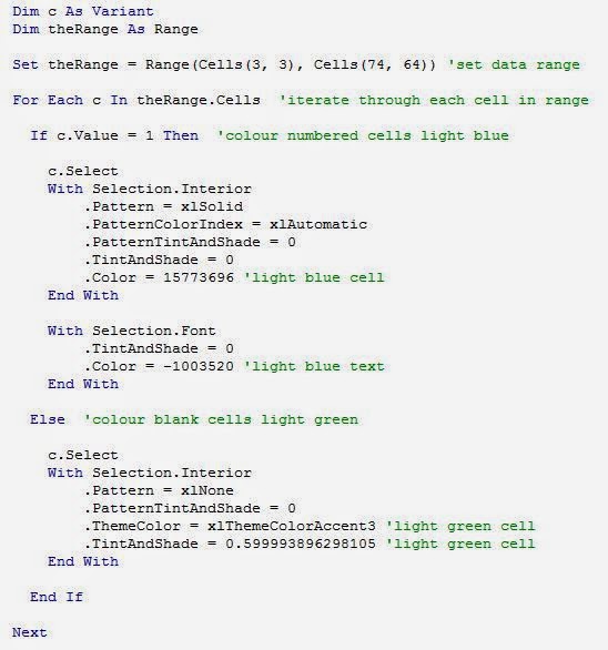
Now for some colour. I want the cells with "1" to be blue, and the blank cells to be green. Since there are few cells with 1, I could simple highlight all cells green then colour the 1 cells blue (and change the "1" text colour to the same blue). That's fine for a one-off, but I intend to repeat the process again, thus I wrote code.


I'll point out some features. Set theRange = Range(Cells(3, 3), Cells(74, 64)) sets the range of cells in the grid that the code will focus on [2]. For Each c In theRange.Cells will point the code to iterate through each cell in the range and do something. That something is colour blue if the cell contains "1", or colour green if the cell in blank. There are three sections that are enclosed with "With" and "End With". The first will turn the cell blue. The second will turn the text colour blue. That last will turn the cell green. After running the code, we get the following.


What is clear from this display is that there simply wasn't enough Breaking Bad episodes. Maybe I'm just sad that there will be no more. I do have the minisodes to watch. And there's Better Call Saul, so yeah!

You may be thinking, what was the point of this display? It's doesn't show that much. This approach may be useful for other purposes. I have used this approach to indicate events over time, such as attendance at a venue or receipt of a service. Provided that the data contains dates, conversion to Year-Month format then use of the pivot table will create the grid structure. The code is to automate the colouring. In my example .Color = 15773696 is light blue cells and .Color = -1003520 is light blue text. .ThemeColor = xlThemeColorAccent3 and .TintAndShade = 0.599993896298105 is for light green colouring. To get the codes for different colours, turn on the "Record Macro" feature (Developer tab), select the desired colour, stop the recorder and take a look at the macro produced for the respective codes for colour to copy and paste into your code.

My pivot table only contains one number. With a variety of numbers, one can apply Conditional Formatting (Home tab) to get various shades of colour. Darker shades indicate higher numbers. One could produce something like this display, yet I don't know what software was used to produce it [3].


Excel is great for simple visual displays, but I am exploring alternatives. I'll start with R and will let you know how it goes.


References and notes
1. Data from Breaking Bad Episodes Wiki page.
2. I hard-coded the cell position numbers for this particular dataset. One can set the code to use relative cell positions.
3. I came across the display via this Reddit thread. It was produced by Project Tycho. The original image was modified by user FortyFs, which I used in this post.