I have put my hand up to volunteer towards an R visualisation package called ggraptR. ggraptR allows interactive data visualisation via a web browser GUI (demonstrated in a previous post using my Fitbit data). The latest Github version (as of 13th September 2016) contains a plotting code generation feature. Let’s take it for a spin!
I have a rather simple data frame called ""dfGroup" that contains the number of Breaking Bad episodes each writer wrote. I want to create a horizontal bar plot with the “Count” on the x-axis and “Writer” on the y-axis. The writers will be ordered from most episodes written (with Mr Vince Gillian at the top) to least (bottom). It will have an awesome title and awesomely-labelled axis. The bars will be green. Breaking Bad green.

Before code gen, I would Google “R horizontal bar ggplot
with ordered bars”, copy paste code then adjust it by adding more code. The
ggraptR approach begins with installing and loading the latest build:
devtools::install_github('cargomoose/raptR', force = TRUE)
devtools::install_github('cargomoose/raptR', force = TRUE)
library("ggraptR")
Launch ggraptR with ggraptR().
Launch ggraptR with ggraptR().
A
web browser will launch. Under “Choose a dataset” I selected my dfGroup data
frame. Plot Type is “Bar”. The selected X axis is “Writer” and the Y is
“Count”. “Flip X and Y coordinates” is checked. And voilà – instant horizontal
bar plot.

Notice
the “Generate Plot Code” button highlighted in red. Clicking on said button – a
floating window with code will appear.

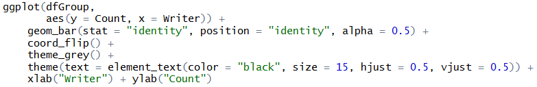
I copied and pasted the code in an R script. I tidied the code a bit as shown below. Running the code (with dfGroup in the environment) will produce the plot as displayed with ggraptR.


One last thing – the bars are not ordered. Currently the
bars cannot be ordered with ggraptR. I can reorder the bars using the reorder
function on the dfGroup data frame. Back in RStudio, I run the following:
dfGroup$Writer <- reorder(dfGroup$Writer, dfGroup$Count)
then execute the modified code above and we have plotting
success!

No comments:
Post a Comment