Showing posts with label ggraptR. Show all posts

Tuesday, 13 September 2016

Building plots with ggraptR’s code gen

Building plots for R newbies is a challenge, even for R not-so-newbies like myself. Why write code when it can be generated for you?

I have put my hand up to volunteer towards an R visualisation package called ggraptR. ggraptR allows interactive data visualisation via a web browser GUI (demonstrated in a previous post using my Fitbit data). The latest Github version (as of 13th September 2016) contains a plotting code generation feature. Let’s take it for a spin!

I have a rather simple data frame called ""dfGroup" that contains the number of Breaking Bad episodes each writer wrote. I want to create a horizontal bar plot with the “Count” on the x-axis and “Writer” on the y-axis. The writers will be ordered from most episodes written (with Mr Vince Gillian at the top) to least (bottom). It will have an awesome title and awesomely-labelled axis. The bars will be green. Breaking Bad green.


Before code gen, I would Google “R horizontal bar ggplot with ordered bars”, copy paste code then adjust it by adding more code. The ggraptR approach begins with installing and loading the latest build:

devtools::install_github('cargomoose/raptR', force = TRUE)
library("ggraptR")

Launch ggraptR with ggraptR().

A web browser will launch. Under “Choose a dataset” I selected my dfGroup data frame. Plot Type is “Bar”. The selected X axis is “Writer” and the Y is “Count”. “Flip X and Y coordinates” is checked. And voilĂ  – instant horizontal bar plot.


Notice the “Generate Plot Code” button highlighted in red. Clicking on said button – a floating window with code will appear.


I copied and pasted the code in an R script. I tidied the code a bit as shown below. Running the code (with dfGroup in the environment) will produce the plot as displayed with ggraptR. 



With a tiny bit of modifying – adding a title, changing the axis titles and filling in the bars with Breaking Bad green, we have the following:


One last thing – the bars are not ordered. Currently the bars cannot be ordered with ggraptR. I can reorder the bars using the reorder function on the dfGroup data frame. Back in RStudio, I run the following:

dfGroup$Writer <- reorder(dfGroup$Writer, dfGroup$Count)

then execute the modified code above and we have plotting success!


Using ggraptR you can quickly build a plot, use code gen to copy the code then modify it as desired. Happy plotting!

Sunday, 29 May 2016

Fitbit 03 – Getting and wrangling all data

Previous post in this series: Fitbit 02 – Getting and wrangling sleep data.

This post will wrap-up the getting and wrangling of Fitbit data using fitbitscraper. This is the list of data that was gathered [1]:
  • Steps
  • Distance
  • Floors
  • Very active minutes (“MinutesVery”)
  • Calories burned
  • Resting heart rate (“RestingHeart”)
  • Sleep
  • Weight.

For each dataset, the data was gathered then wrangled as separate tidy data frames. Each data contained a unique date per row. Most datasets required minimal wrangling. A previous post outlined the extra effort required to wrangle sleep data due to split sleep sessions and some extra looping to gather all weight data.

Each data frame contains a Date column. The data frames are joined by the unique dates to create one big happy data frame of Fitbitness. Each row is a date containing columns of fitness factors.

Now what? I feel like a falafel. I’m going to eat a falafel [2].

With this tidy dataset I will continue the analytics journey in future posts. For now, I wish to quickly visualise the data. Writing lines of code for plots in R is not-so-quick. Thankfully there’s a point-and-click visualisation package available called ggraptR. Installing and launching the package is achieved as follows. 
devtools::install_github('cargomoose/raptR', force = TRUE) # install
library("ggraptR") # load
ggraptR() # launch

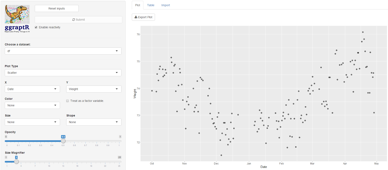
My main hypothesis was that steps/distance may correlate with weight. There was no relationship observed on a scatter plot. This is preliminary, future post will focus on exploratory data analysis. Prior to data analysis I need to ask some driving questions.


I plotted Date vs Weight. My weight fell gradually from October 2015 through to December. I was on a week-long Sydney to Adelaide road trip during the end of December, got a parking ticket in Adelaide and did not have recorded weights whilst on the road. My weight steadily increased since. Not a lot of exercise, quite a lot of banana Tim Tams.


After sequential pointing-and-clicking, I overlayed this time plot with another factor - the “AwakeBetweenDuration”. In the previous post I noted I wake-up in the middle of the night. It may take hours before I fall asleep again. The tidy dataset holds the number of minutes awake between such sessions. The bigger the bubble, the longer I was awake between sleep sessions.


Here’s a driving question: what accounts for the nights when I am awake for long durations? I was awake some nights in October, December (some of my road trip nights – I couldn’t drive for one of those days as I was exhausted), January and then April. February and March appeared almost blissful. Why? Tell me data, why?  

Here is the Fitbit data wrangling code published on GitHub, FitbitWrangling.R: https://github.com/muhsinkarim/fitbit Replace “your_email” and “your_password” with your email and your password used to log into your Fitbit account and dashboard.


References and notes
1. The fitbitscraper function get_activity_data() will return rows of activities per day including walking and running. I only have activity data from 15th February 2016. Since I’m analysing data since October 2015 (where I have weight data from my Fitbit scales) I chose not in include activity data in the tidy dataset.
2. I ate two.