Sunday, 13 November 2016

What is linear regression?

I am currently enrolled in a part time General Assembly Data Science course and I have homework… On a Sunday. A homework question reads as follows:

Imagine you are trying to explain to someone what Linear Regression is - but they have no programming/maths experience? How would you explain the overall process, what R-Squared means and how to interpret the coefficients?

This is my most favourite question on a first date. Linear regression is a modelling technique that explores potential relationships between variables. This could be between height and weight, number of viewed ads and sales, or perhaps the number of times I refresh my blog and the non-changing page view count.

More details? Sure, but I need to define some terms. I’ll use friendly bold headings along the way.

Independent and dependant variables

The dependant variable is the thing that may depend on (be influenced by) the independent variable. Weight (dependent) may depend on height (independent). The two relationships can be swapped – height may depend on weight. Linear regression can examine both for you.

Further, regression attempts to estimate or predict, for each individual, the numerical value of some variable for that individual [1]. I, being almost six-foot tall could use linear regression to get an estimate of my weight based on data from others males my age. I’m taller than Jake Gyllenhaal, so I predict I weigh more than him.

What about R-squared and interpreting coefficients? To answer, I need some diagrams. The following screengrabs are from an online course, “Data Science A-Z” at Super DataScience. In this simple linear regression example, the relationship between years of experience (x-axis) and salary (y-axis) is used.


Ordinary least squares and residual sum of squares

Linear regression will fit the “best” trendline through the data points as a model. Multiple trendlines can be produced through the data points. What occurs behind the scenes is an approach called “ordinary least squares”, which uses the distance between each data point to each examined trendline (see the next image). The distances are squared then summed, returning a value called the “residual sum of squares” for each fitted trendline (model). The best fitting line has the smallest residual sum of squares, that is, the smaller error out of all trendlines – the one that fits the data best.


Coefficients and unit change

In this simple linear regression example the model (best fitting trendline) can be described by the below equation. y is expected salary. x1 is the years of experience. b0 is a constant and equal to 30k in this model because, when years of experience (x1) is zero, salary (y) becomes equal to the constant b0. The image below shows that when years of experience is zero, the expected salary is 30k (circled in red). When I was a student on a Government PhD scholarship, it averaged 20k tax-free annually. This information is not relevant to linear regression. It’s simply a fun fact (about me, so it’s fun).

The coefficient b1 describes how a unit change in x1 effects y. At school, we called it the slope. In this example, the slope is equal to 10k (green arrows and projected dashes below). A unit change in experience (one year) will result in a 10k change (increase) in salary.


For multiple linear regression, there are more independent variables (x1, x2, x3, etc) and each has it’s own coefficient (b1, b2, b3, respectively). I’m not going to showcase an example of multiple linear regression here. Coefficients are the multipliers of each independent variable. Coefficients indicate how much the dependent variable (eg. salary) is expected to increase by one independent variable (eg. years of experience) holding all other independent variables constant (such as other related variables of interest if we had the data including years of education, gender, age, etc) [2].

I hope that answers what a coefficient is, at least in this simple linear regression example.

R-squared 

Recall the model produced the best-fitting trendline with the smallest residual sum of squares out of other possible models (using ordinary least squares). Let’s imagine if we didn’t have this trendline as the model but instead used the average trendline (cutting across the average salary, across the y-axis, shown below). I like to think of this as the lazy-person’s not-so-great model but might-just-do. To represent data, taking the average is not a bad start.

We can work out a measure of the total sum of squares using the average trendline similar to deriving the residual sum of squares above. For total sum of squares, the distance between the points to the average trendline (red dotted vertical lines shown below) are squared and summed.


Quick recap – we have the residual sum of squares (SSres) from the best-fitting model and now the total sum of squares (SStot) from the average model.

R-squared is 1 – SSres/SStot. Why? I’m not entirely sure, but I know what happens to R-squared when the residual sum-of-squares (SSres) changes.

R-squared indicates how close the data are to the fitted regression line, using the average of y (eg. salary) as a baseline model. Look again at the R-squared equation – as SSres gets smaller (smaller error), R-squared will increase. The ideal case is that the model has zero residual sum of squares, which will result in an R-squared of 1. An R-squared of 1 suggests a perfect correlation between the independent and dependent variables (eg. a perfect correlation between years of experience and salary). This does not happen in practice, but the closer the R-squared is to 1, the greater the likelihood of a relationship between the variables in the model.

I shall stop here. I admit, the explanation was lengthy. In order to explain coefficients, I had to mention ordinary least squares and residual sum of squares. This in turn facilitated the description of R-squared. But on the plus-side you learnt that I’m at least 1.8 meters tall and used to live on 20k. Regression question – does income share a relationship with body height? Does cheap pizza stunt growth?


References and notes 
1. From “Data Science for Business” by Foster Provost and Tom Fawcett.
2. I confess, this line is mysterious - “holding all other independent variables constant”? The explanation of this goes beyond a simple description of linear regression. Future blog post.

Wednesday, 9 November 2016

Super DataScience podcast

I am working my way through the Udemy data science course “Machine Learning A-Z” by Kirill Eremenko and Hadelin de Ponteves. The course steps through key machine learning algorithms and approaches using Python and R. As an R programmer, it’s great to compare to the Python code and learn it’s syntax. From my nascent observations, it takes fewer lines to code an approach with R compared to Python.

Kirill and Hadelin are clear communicators. They break-down complex information, guiding the viewer with palatable bite-sized chucks of information. I was so impressed that I sent Kirill a thank you on Udemy. Kirill responded, we added each other on LinkedIn, then he invited me as a guest on his podcast at Super DataScience!

My episode can be found here, here and here. Three links, same episode - Woo!

Thanks to Kirill for having me as a guest and giving me an excuse to talk about neuroscience – something I haven’t done for the past three years. The dorsal lateral prefrontal cortex got a mention :)

Saturday, 29 October 2016

FODMAPs 02 – Exploratory data analysis… Also, I think I have a beef and wedding intolerance

Previous post in this series: FODMAPs 01 – Data collection.

I have been collecting data for five weeks in an attempt to identify what foods cause my symptoms of food intolerances. Using the Memento Database app, I log the intake of each food/ingredient, which is datetime stamped. Here’s a snapshot of the exported CSV. The Fibre column indicates if I took some psyllium husk as recommended by my dietitian. Enzymes indicates when I took a magic out-of-body enzyme pill, which was rare.


My intolerance symptoms post-meal was recorded with datetime stamps. I used four descriptions: "Bloated" was when I was feeling, well, bloated. "Tightening" was when my guts felt uncomfortably tight during digestion. "Fatigue" was when I suddenly felt tired. "Abdominal pain" indicated sharp stabby pains in my gut. Since I’m not concerned about these distinctions, I coded each symptom with “1”. I wish to identify the foods that cause ANY symptoms of intolerance. A good day is when I have no symptoms.

The data was wrangled. Datetimes were coerced to dates. Foods and Symptoms datasets were joined by date. Here’s a look at the merged data in RStudio. It’s terribly simple – Date, Food, Symptoms (flagged with “1” when present on a given date).


I’m no dietician/nutritionist. I assume that when one tries to identify problem foods in one’s diet they look at when the symptoms occur, then look back to see what foods were consumed. With that general approach, I chose some strict parameters to identify the bad foods that led to intolerance symptoms.

Any day of a symptom is considered a bad day. Even one symptom. Thus, a good day was a symptom-free day. To my delighted surprise, I had a string of good days. Setting my diet to low-FODMAPS did make me feel generally better. I was less fatigued, I could concentrate more at work, and I had more nights of decent sleep. Sure, I became a social bore when I limited what food I could eat when dining out. Telling friends I could just go out for tea was met with disappointment. It was easier to stay at home and eat cold cuts by my lonesome. This was all in the name of science, and data, and in the next blog post, some data science (logistic regression).

Consider the good days. The code would look at the previous day and note the foods that were consumed. These foods were all considered “good”. Let’s think about this moving forward in time – I would eat all this good mostly gluten-free food. The following day I would be symptom-free. Therefore, any food the day before a symptom-free day is in my good books.

Consider the bad days. Similar premise – any food consumed the day before a bad day are bad foods. But not all of them. I have a mix of good and bad foods, followed by a bad day. I can’t cast the good foods caught in this net as bad by association. Therefore, any food on my good food list was used to subtract-out from the bad food list. A “really bad” food list became the difference. Drum roll… Here are the really bad foods.


OK, a couple of things stood out. I think I’m allergic to weddings. “wedding beef”, “wedding cake”, “wedding canapes”, “wedding salad”. Guys, I went to a weeding during the diet, OK? I couldn’t not eat the food, it was really really good. Other foods consumed at the wedding included the potato, prawns, pumpkin, oysters. Resolution one: Avoid weddings [1].

There was another grouping I discerned from the really bad foods list. “beef mince”, “beef patties”, “olivo wagyu steak”, “wedding beef”. OMG, I think I have a beef intolerance. No! Stupid, stupid ethnic digestive tract, why?

I Googled – beef intolerance is indeed a thing. As is intolerance towards asparagus, basil and cauliflower. I’m not jumping to conclusions. I have an appointment with my dietitian in several weeks, and I’ll show her the data. She may very well think this approach was a bit much, but, I truly believe that the little data we collect has meaning. Now, it’s easier to collect data, primarily because most data collection occurs in an automated fashion. From Fitbit to Netflix and Google, there’s a spectrum of our personalised data being gathered. Sometimes this data is accessible, such as from Fitbit. Taking those next steps from reported data to insightful and actionable data may take some coding [2].


References and notes
1. I was concerned that my bad days were simply the wedding day. Not the case. I had 16 days when I consumed from the really bad foods list.
2. The code fodmaps_wrangling_exploration.R is on GitHub repo: https://github.com/muhsinkarim/fodmaps

Wednesday, 28 September 2016

Facebook experiments – Using a technical glitch to nudge user’s behaviour, maybe

For a couple of weeks’ I would log onto Facebook and two of my friend’s chat windows would appear. I would close them both down, mindlessly browse the News Feed then switch to something more interesting, with turns out to be anything. The next day I would repeat the process – the same two chat windows popped-up, unprompted by any messages from my friends. I’m not an active Facebook user, yet this was irritating. I half-heartedly Googled for a solution but gave up because only half my heart was invested.


Earlier this week I logged on and the issue appeared to have resolved itself. Yesterday I received a message from one of these Facebook friends via my Messenger app. This friend asked if I was free for coffee on the weekend. I am and wrote back. I’ve only met this person twice in real-life occasions spread over years, but the last time we spoke (about a month ago) we got on well and we swapped a few Facebook messages after. I’m glad she arranged a meet-up in the real-world.

Then my paranoia set in. Was this apparent chat window glitch a cleverly disguised Facebook experiment? We know that Facebook runs experiments. What if Facebook sampled its users, popped-up some chat windows, then tracked how many people engaged in further chats? Did the display of the glitch windows cause a lift in chat-engagement? With some text analysis, did it result in plans for a real-world meet-up?

I barely see these two friends – one is living in regional NSW and the glitchy chat window is not compelling enough for me to visit her where there is no city. I’ll check with my real-life coffee friend if she received my chat window as a pop-up and whether it nudged her to reach out. If so, cool. The potential for Facebook to run different experiments is expansive and creative – using glitches as a guise, what else can/do they do? As a former research scientist, I respect it and am envious that they can tweak the Facebook world, sit back and watch users shift their behaviour.

Saturday, 24 September 2016

FODMAPs 01 – Data collection

There’s something in my diet that ain’t sitting right. It makes me feel bloated, fatigued and just damn uncomfortable. It’s been like this for years, though it’s been tolerable. Recently I went to a dietitian/nutritionist to learn more about what I should and should not shove down my mouth.

After describing my general diet, I received advice that will sound obvious to most. I need more fruits, vegetables, fibre and water.
“How many fruits and veges am I supposed to eat?”, I asked.
“Two serves of fruit, three serves of vegetables a day.”
“Oh, so the recommendation hasn’t changed since kindergarten?”. I was really hoping that it had been scaled back to two fruits per day. Or one magic fruit pill.

I took the advice as best as I could manage (who has time to eat five serves of vegetables a day? Takes so long to chew). There were marginal improvements. I felt less bloated and fatigued, so my decisions were leading me in the right direction. Similarly, I had stopped drinking coffee back in March and noted improvements. Each dietary change added an improvement.

However, I still feel uncomfortable. Years ago I attempted to rectify my dietary issues with data. I recorded what foods I was eating and what symptoms I felt day to day with the intention to analyse my way to a remedy. I planned to “net” what foods caused upset. I never got around to the analysis.

I’m getting around to it now. I have the right tools.

The nutritionist said I should try a low FODMAP diet. FODMAPs are a group of carbohydrate that are poorly digested. After a FODMAP diet of at least 6 weeks, I’ll gradually reintroduce different FODMAP groups and note my tolerance. I can identify my problem foods then avoid them. But not ice cream. If ice cream is a problem food, I’ll just take lactase beforehand.

I need an app that collects my food intake. I’ve used myfitnesspal in the past. When I Googled for instructions on exporting my data, I couldn’t find a clear guide, or it was a paid option. I can log foods with the Fitbit app, however retrieving the data is also not easy. The Fitbit R scraper I use does not retrieve food data. I would have to access my data via an API.

Instead I’ll use the Memento Database app. Memento Database allows users to customise fields for data capture then easily export the data as CSV. My “Food” library captures the foods or ingredients I consume with the current datetime captured upon entry. I will use short general labels for foods and ingredients as possible since I’d like to group the foods for analysis.

My “Symptoms” library captures a symptom with the datetime. I used to enter detailed symptom descriptions. I want to keep it brief. I'll include feelings of "Fatigue" or feeling "Bloated". The symptoms will be placed in a single-choice list. I expect that these symptoms will decrease as I persist with the lower FODMAP diet. The symptoms will increase when I reintroduce the problem FODMAP groups. Ice cream will totally be fine. Totally.

I will combine this food and symptom data with Fitbit data, namely calories burned, weight and sleep. I’m curious to see if my weight changes with the diet (assuming little change in the calories burned day-to-day) or if my sleep improves. 

In say, 6 weeks’ time, I’ll have data to wrangle then analyse.

Tuesday, 13 September 2016

Building plots with ggraptR’s code gen

Building plots for R newbies is a challenge, even for R not-so-newbies like myself. Why write code when it can be generated for you?

I have put my hand up to volunteer towards an R visualisation package called ggraptR. ggraptR allows interactive data visualisation via a web browser GUI (demonstrated in a previous post using my Fitbit data). The latest Github version (as of 13th September 2016) contains a plotting code generation feature. Let’s take it for a spin!

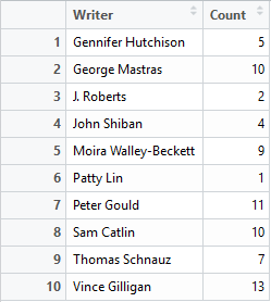
I have a rather simple data frame called ""dfGroup" that contains the number of Breaking Bad episodes each writer wrote. I want to create a horizontal bar plot with the “Count” on the x-axis and “Writer” on the y-axis. The writers will be ordered from most episodes written (with Mr Vince Gillian at the top) to least (bottom). It will have an awesome title and awesomely-labelled axis. The bars will be green. Breaking Bad green.


Before code gen, I would Google “R horizontal bar ggplot with ordered bars”, copy paste code then adjust it by adding more code. The ggraptR approach begins with installing and loading the latest build:

devtools::install_github('cargomoose/raptR', force = TRUE)
library("ggraptR")

Launch ggraptR with ggraptR().

A web browser will launch. Under “Choose a dataset” I selected my dfGroup data frame. Plot Type is “Bar”. The selected X axis is “Writer” and the Y is “Count”. “Flip X and Y coordinates” is checked. And voilĂ  – instant horizontal bar plot.


Notice the “Generate Plot Code” button highlighted in red. Clicking on said button – a floating window with code will appear.


I copied and pasted the code in an R script. I tidied the code a bit as shown below. Running the code (with dfGroup in the environment) will produce the plot as displayed with ggraptR. 


With a tiny bit of modifying – adding a title, changing the axis titles and filling in the bars with Breaking Bad green, we have the following:


One last thing – the bars are not ordered. Currently the bars cannot be ordered with ggraptR. I can reorder the bars using the reorder function on the dfGroup data frame. Back in RStudio, I run the following:

dfGroup$Writer <- reorder(dfGroup$Writer, dfGroup$Count)

then execute the modified code above and we have plotting success!


Using ggraptR you can quickly build a plot, use code gen to copy the code then modify it as desired. Happy plotting!

Sunday, 29 May 2016

Fitbit 03 – Getting and wrangling all data

Previous post in this series: Fitbit 02 – Getting and wrangling sleep data.

This post will wrap-up the getting and wrangling of Fitbit data using fitbitscraper. This is the list of data that was gathered [1]:
  • Steps
  • Distance
  • Floors
  • Very active minutes (“MinutesVery”)
  • Calories burned
  • Resting heart rate (“RestingHeart”)
  • Sleep
  • Weight.

For each dataset, the data was gathered then wrangled as separate tidy data frames. Each data contained a unique date per row. Most datasets required minimal wrangling. A previous post outlined the extra effort required to wrangle sleep data due to split sleep sessions and some extra looping to gather all weight data.

Each data frame contains a Date column. The data frames are joined by the unique dates to create one big happy data frame of Fitbitness. Each row is a date containing columns of fitness factors.

Now what? I feel like a falafel. I’m going to eat a falafel [2].

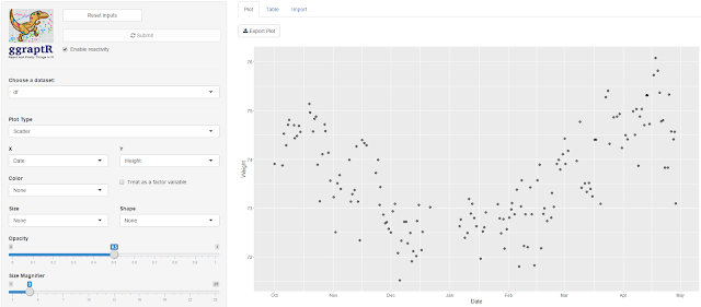
With this tidy dataset I will continue the analytics journey in future posts. For now, I wish to quickly visualise the data. Writing lines of code for plots in R is not-so-quick. Thankfully there’s a point-and-click visualisation package available called ggraptR. Installing and launching the package is achieved as follows. 
devtools::install_github('cargomoose/raptR', force = TRUE) # install
library("ggraptR") # load
ggraptR() # launch

My main hypothesis was that steps/distance may correlate with weight. There was no relationship observed on a scatter plot. This is preliminary, future post will focus on exploratory data analysis. Prior to data analysis I need to ask some driving questions.


I plotted Date vs Weight. My weight fell gradually from October 2015 through to December. I was on a week-long Sydney to Adelaide road trip during the end of December, got a parking ticket in Adelaide and did not have recorded weights whilst on the road. My weight steadily increased since. Not a lot of exercise, quite a lot of banana Tim Tams.


After sequential pointing-and-clicking, I overlayed this time plot with another factor - the “AwakeBetweenDuration”. In the previous post I noted I wake-up in the middle of the night. It may take hours before I fall asleep again. The tidy dataset holds the number of minutes awake between such sessions. The bigger the bubble, the longer I was awake between sleep sessions.


Here’s a driving question: what accounts for the nights when I am awake for long durations? I was awake some nights in October, December (some of my road trip nights – I couldn’t drive for one of those days as I was exhausted), January and then April. February and March appeared almost blissful. Why? Tell me data, why?  

Here is the Fitbit data wrangling code published on GitHub, FitbitWrangling.R: https://github.com/muhsinkarim/fitbit Replace “your_email” and “your_password” with your email and your password used to log into your Fitbit account and dashboard.


References and notes
1. The fitbitscraper function get_activity_data() will return rows of activities per day including walking and running. I only have activity data from 15th February 2016. Since I’m analysing data since October 2015 (where I have weight data from my Fitbit scales) I chose not in include activity data in the tidy dataset.
2. I ate two.