The example I use here is terribly simple. Yet a collection of simple techniques can create complexity. Let's colour in data from a pivot table using VBA code. I have the dates of when Breaking Bad episodes aired in the States [1]. I want to see, via a calendar-style display, when these episodes aired over the years of sheer television awesomeness.
Here is the data. The text in blue is text I modified or created. The dates from Wikipedia had to be reformatted to DD/MM/YYYY format. I then used the
=Year(),
=Month() and
=CONCATENATE() formula to get the dates into Year-Month format.
I selected all of the data and created a pivot table (Insert tab, then "PivotTable"). On the right hand "PivotTable Field List" panel, I dragged in "No. in series" under “Column Labels, dragged in "Year-Month" under "Row Labels" and selected the Count of No. in series under "Values". You will see the episode series numbers 1 to 62 across the columns, and the Year-Month down the rows. The "1" in the cells indicate that the respective episode aired on the row's Year-Month.
To get a better representation of time, I included the Year-Months that did not air a Breaking Bad episode by inserting rows. These are shown in blue.
Next, I prettied things up. Added headers for the seasons and Year-Months, and included grid lines. I narrowed the column widths to make square cells. Notice that going down the rows, for each year there are twelve cells (January to December).
Now for some colour. I want the cells with "1" to be blue, and the blank cells to be green. Since there are few cells with 1, I could simple highlight all cells green then colour the 1 cells blue (and change the "1" text colour to the same blue). That's fine for a one-off, but I intend to repeat the process again, thus I wrote code.
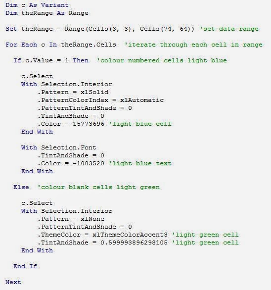
I'll point out some features. Set theRange = Range(Cells(3, 3), Cells(74, 64)) sets the range of cells in the grid that the code will focus on [2]. For Each c In theRange.Cells will point the code to iterate through each cell in the range and do something. That something is colour blue if the cell contains "1", or colour green if the cell in blank. There are three sections that are enclosed with "With" and "End With". The first will turn the cell blue. The second will turn the text colour blue. That last will turn the cell green. After running the code, we get the following.
What is clear from this display is that there simply wasn't enough Breaking Bad episodes. Maybe I'm just sad that there will be no more. I do have the minisodes to watch. And there's
Better Call Saul, so yeah!
You may be thinking, what was the point of this display? It's doesn't show that much. This approach may be useful for other purposes. I have used this approach to indicate events over time, such as attendance at a venue or receipt of a service. Provided that the data contains dates, conversion to Year-Month format then use of the pivot table will create the grid structure. The code is to automate the colouring. In my example .Color = 15773696 is light blue cells and .Color = -1003520 is light blue text. .ThemeColor = xlThemeColorAccent3 and .TintAndShade = 0.599993896298105 is for light green colouring. To get the codes for different colours, turn on the "Record Macro" feature (Developer tab), select the desired colour, stop the recorder and take a look at the macro produced for the respective codes for colour to copy and paste into your code.
My pivot table only contains one number. With a variety of numbers, one can apply Conditional Formatting (Home tab) to get various shades of colour. Darker shades indicate higher numbers. One could produce something like this display, yet I don't know what software was used to produce it [3].

Excel is great for simple visual displays, but I am exploring alternatives. I'll start with R and will let you know how it goes.
References and notes
2. I hard-coded the cell position numbers for this particular dataset. One can set the code to use relative cell positions.